How the Justice League #SnyderCut can become a game-changer
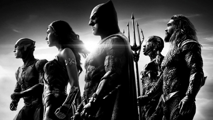
With the long-hyped “SnyderCut” nearly upon us, critic Luke Buckmaster embarks on a crash-course in movie history to explain how this unusual project has an opportunity to become a game-changing production.
Mention the words “aspect ratio” and the eyes of your average reader will roll back into their sockets. The few people schooled in this subject probably wish it’d been a more interesting name—like SIGHT MATRIX or VISION DOMINATOR. Nevertheless, the cool kids are talking about aspect ratios these days, at least a little bit, in relation to one very zeitgeisty event—the impending arrival of Justice League: The Zack Snyder Cut (aka the #SnyderCut).
The director’s long-awaited alternate version to his poorly regarded 2017 superhero movie (the production of which was interrupted by the death of his daughter, prompting the studio to hire Joss Whedon to finish it) premieres on March 18, following several years of speculation and a sustained social media campaign to wish it into existence. With a budget pegged at around US$70 million, and a reported running time of approximately four hours, the project offers Snyder a rare opportunity for a second crack: the moviemaking equivalent of the question “what would you do if you had your time again?”.
Although it’ll have only about four minutes of brand new footage (plus lots excised from the theatrical release) the minds of fans are dancing with speculation about what the refashioned film might look like. With that attitude in mind—of imaginative possibilities, and the hope that a fine work of art could emerge—I have explained, below, my thoughts on how Snyder could create not just a good movie, but a watershed visual production and a game-changer for the superhero genre.
Do I think he will do this? No. Do I think he should? Yes. A thousand times yes. And it all begins with that aspect ratio…
Let’s get the 4:3 stuff out of the way first
Snyder has confirmed his rejigged film will be presented in a 4:3 aspect ratio, meaning for every four inches displayed horizontally there will be three inches displayed vertically. This is close to the proportions of a square, so black bars will appear on the left and right of your television when you watch it. Although less of your TV screen will be used, it will actually result in you seeing more of the movie, given the director shot all of it on 4:3—the format of IMAX screens—with the footage later cropped into a widescreen ratio.
For a visual indication of how this looks, here’s a mock-up created by IGN, showing how much more visual information is provided in the 4:3 ratio (also known as 1.33:1) compared to the 1.85:1 widescreen ratio, which is a common widescreen format.
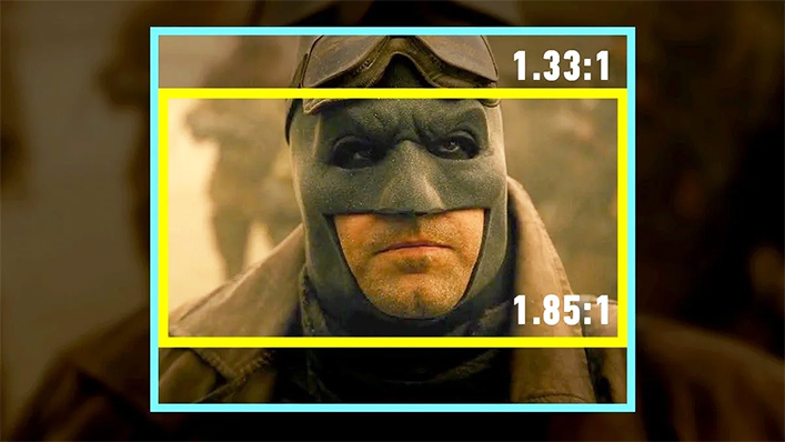
Rather than pursuing some lofty creative rationale, Snyder simply (by his own admission) shot the film in the square-ish format in order to optimize it for the biggest screens (IMAX) possible. But as directors such as Wes Anderson remind us, aspect ratios are aesthetic choices rather than technical requirements—and an extremely powerful tool to play around with.
The dream: an aspect ratio that’s fluid rather than fixed
What I’d love to see in the #SnyderCut—and what would set it apart from other superhero movies—is an aspect ratio that’s fluid rather than fixed, changing at various points in the running time in response to the contents of each scene. Square, sure, but widescreen on some occasions and vertical and thin on others.
In other words: it should have multiple aspect ratios—not one. And many different sized windows and boxes to accommodate them; perhaps appearing on screen simultaneously. Can you think of an art form with a visual structure that relies on the presentation of panels and box-like displays?
If you thought “comic books” you can probably see where I’m going. In comics some panels are thin and tall; some are wide; some are square; some bleed into each other. There is no single fixed perspective. It’s hard to think of a stylistic decision more suited to comic book adaptations like Justice League than using the frame not as a space that needs to be filled per se, but as a playground for a multi-display approach.
Playful precedents, from Hulk to Mommy
When we discuss multiple windows that appear on screen, to replicate the look and feel of comic books, one production stands out from any other: Ang Lee’s over-looked 2003 movie Hulk, starring Eric Bana as the bright green and famously furious Jekyll and Hyde hero.
Several things are annoying about this film: its languorous pace and overlong running time; loads of mundane dialogue, tantamount to sullen waffle; and Bana’s flat po-faced performance. Nevertheless it is a rare example of a superhero movie that is visually interesting, infusing its DNA with the art form of its origins. I can demonstrate this just by recalling a single shot…
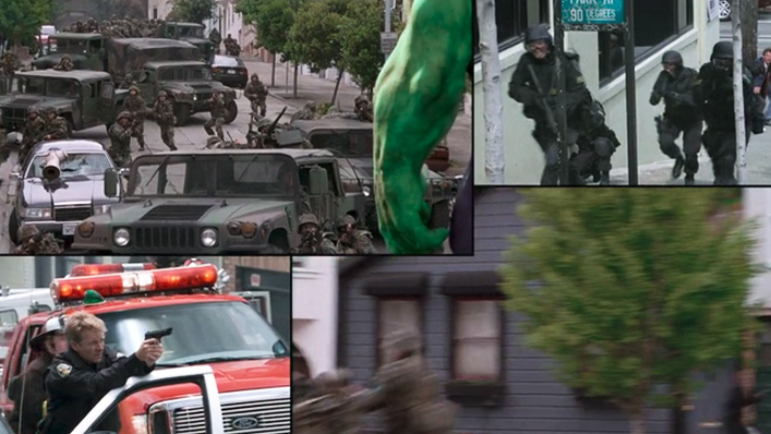
…which of course is actually four shots rolled into one. Cool, huh? In an essay I wrote about the MCU in 2019, I argued that Hulk is in fact the most significant Marvel movie ever made:
“…because it proposes a blueprint, informed by the visual structure of comic books, for how superhero movies could have had a unique cinematic style.
Through inventive use of split-screen images and transitions, Lee embraces the box-like composition of the printed comic book, and turns it into a feast—of frames within frames and various windows into reality….
If filmmakers had expanded on its ideas, the modern superhero movie might have had an aesthetic bedrock and at least the beginning of a style to call its own—comparable to the sharp angles and distorted landscapes of German Expressionism, say, or the continuity-breaking editing techniques of the French New Wave.”
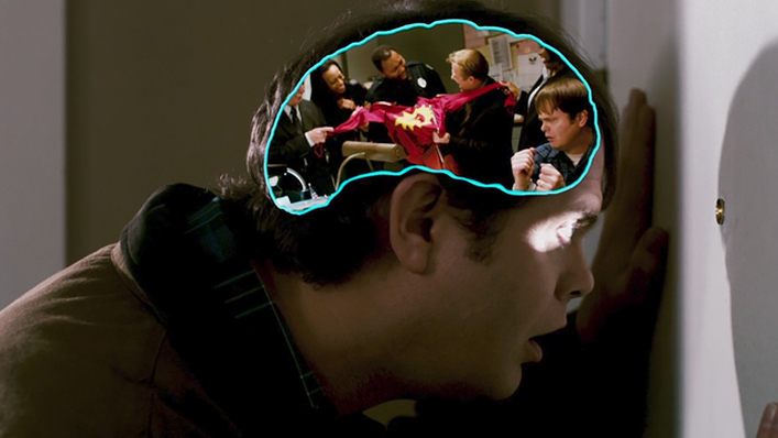
Many other films have tossed around experiments with comic book style designs. Two excellent titles come to mind: 2018’s Spider-Man: Into the Spider-Verse, with its dizzying array of animated aesthetics and its residence in one of modern cinema’s most exciting movements, and James Gunn’s superb 2010 black comedy Super, which uses the story of an eccentric crank (Rainn Wilson) to explore the relationship between mental illness and vigilantism. At one point Gunn shows a scene that plays out in a thought bubble inside Rainn Wilson’s head; you might call the aspect ratio of this footage “brain shaped”.
Plenty of other titles outside the superhero genre have dabbled with expanding and contracting aspect ratios in ways that could—should—have inspired Snyder. Sam Raimi’s Wizard of Oz prequel Oz the Great and Powerful, for instance, begins in 4:3 black and white then switches to full colour and a 2:35:1 aspect ratio, expanding an idea used in the 1939 classic. The finale of the brilliant 1927 epic Napoleon uses three square screens to project three separate images, sometimes combining to form a mega widescreen.
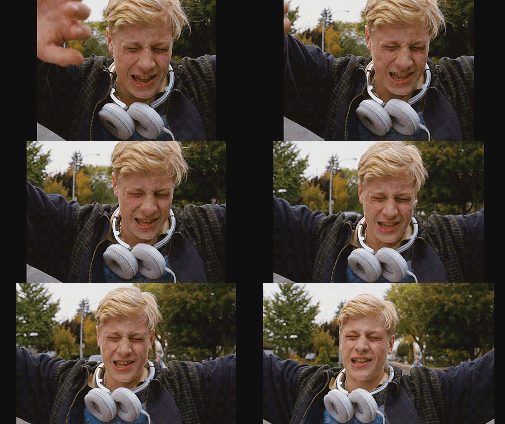
And Xavier Nolan’s 2014 drama Mommy, about a single mother raising a son with ADHD, is a rare example of a film presented in the 1:1 square ratio—at least for the most part. Check out how the protagonist in one scene appears to grab the borders of the film itself and stretch them with his own hands.
The ‘Dynamic Screen’ revisited
Anyway, back to the square. Snyder’s decision to present Justice League in the 4:3 ratio (which isn’t an exact square, but it’s close) is a historical accident; it wouldn’t have happened had IMAX screens been in a different format. But that doesn’t mean he hasn’t chanced upon some interesting preexisting ideas and theories.
Almost a century ago, arguing that cinema’s reliance on a widescreen format arose due to the creatively stifling influence of western paintings and landscape imagery, the great director Sergei Eisenstein proposed a square-shaped ‘Dynamic Screen’ that could shift between vertical and horizontal compositions, affording no preference to either format. This square would, he said, encourage filmmakers to “embrace the multitude of expressive rectangles in the world, and even to move fluidly between them within a single film”.
Sounds pretty good, right? The ‘Dynamic Screen’ is discussed in this excellent video from a series called ‘A Machine for Viewing’. It includes this shot from Eisenstein’s Battleship Potemkin:
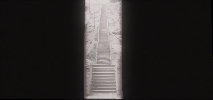
Which looks, in terms of aspect ratio, not dissimilar to the very first shot in the original version of Justice League:
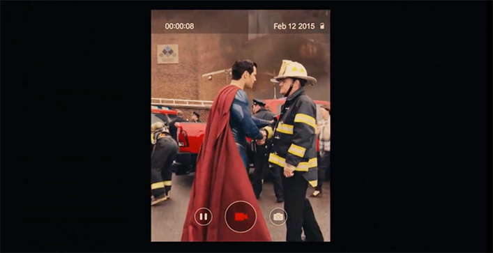
There’s a big difference in the motivation behind these images. Eisenstein after all wanted to break the rules and Snyder to reinforce them—by replicating the portrait mode of a smartphone. But both shots remind us, again, that aspect ratios are aesthetic choices, and many things are possible with an imaginative approach.
Moving beyond the frame
Where this conversation is moving towards is a display format that goes beyond the frame and has no fixed parameters, morphing and changing according to the content. These displays already exist in virtual and augmented realities. Sometimes they look, in fact, like an interface depicted in Justice League (which may or may not make it into the recut), during a scene in which Cyborg (Ray Fisher) examines photographs of Batman by scrolling through an AR-esque display he loads by stretching his hands—not unlike the screen-extending man in Mommy.
Most people aren’t watching these kinds of displays yet. However filmmakers like Snyder have an opportunity to toss out the rule book and experiment with their own kinds of frames; their own versions of “expressive rectangles”. Why can’t Snyder’s modus operandi, like Eisenstein’s, be all about experimentation—especially when he’s been given $70 million to play around with, and a lot of goodwill from fans? It would be a shame if he didn’t put it to good use.


