By subverting comic book movies, Into the Spider-Verse evolved the animation industry
Ahead of the release of the highly anticipated Spider-Man: Across the Spider-Verse, Liam Maguren looks at how 2018’s groundbreaking Into the Spider-Verse subverted the comic book superhero genre, and how that decision led to an animation revolution.
Spider-Man: Into the Spider-Verse
Superhero films and blockbuster animation tend to play things safe. Numbingly safe, perhaps. We get the logic: the more money a studio pours into a film, the fewer risks they’re willing to take. It’s why 2018’s Spider-Man: Into the Spider-Verse felt like a miracle wrapped in a godsend.
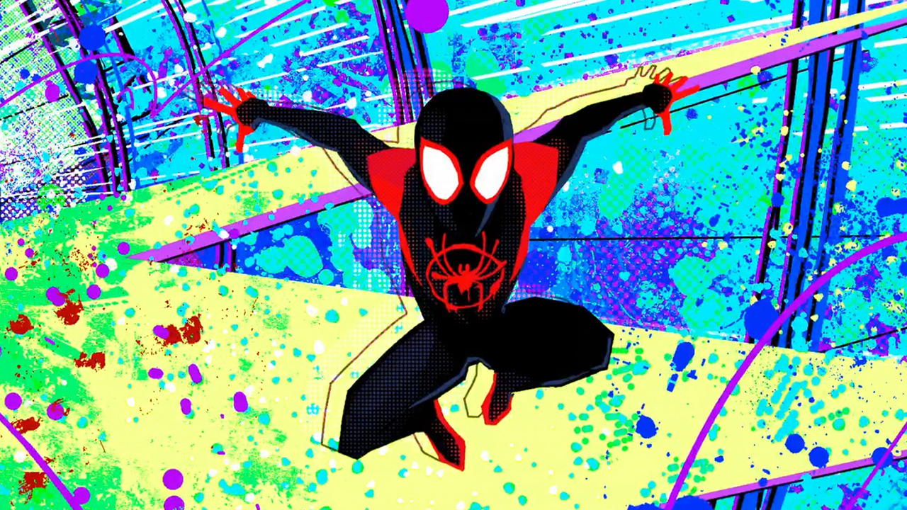
The film’s standout qualities were evident to everyone who saw the first teaser trailer. Launching a tactical torpedo at the idea of “a comic book come to life,” this was guaranteed to be a film unlike any we’d seen before.
Who knew we’d feel that way about another Spider-Man film? At this point, cinema already shuffled through three Peter Parkers (Tobey Maguire, Andrew Garfield and Tom Holland) so spotlighting Miles Morales felt like a thwip in the right direction. But it’s the narrative that makes this film swing, and it was done by subverting our learned expectations of Peter Parker’s over-told story.
Cue producers Phil Lord (also co-writer) and Christopher Miller, the beloved subverters who helped construct a bespoke look for 2014’s fantastic The LEGO Movie and ably flipped audience expectations with not one but two Jump Street films. Where the latter reacted to the question, “Why are they rebooting this” with a bunch of meta-jokes, Spider-Verse prepped for the response, “Why are they telling the same old Spider-Man story” with a framing device completely dependent on its striking look.
Co-existing with Parker’s Spider-Man, a real-life hero who also features on comic book covers, Spider-Verse places Miles in the centre of his own comic book story. The film treats this literally with obvious elements like speed lines, visualised onomatopoeia, colour bursts, and playful use of panels. It’s also in the finer details: replacing blur effects with colour splits, complementing lighting with halftone dots, accentuating shadows with hatch marks, and adjusting the frame rate to emphasise poses just like a comic book.
Sony Animation Studios pulled off the look so well, Sony tried to patent it.
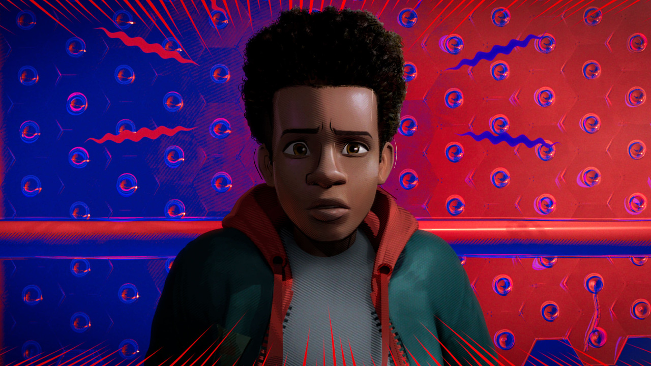
But it goes beyond looking cool. This meta-comic-book world allows for a Spider-Man universe where Spider-Man is overexposed IP—a relatable feeling to almost anyone keeping track of every Marvel film. “All right, let’s do this one last time,” Parker says for the first of many times as a Spider-Man comic lands into frame, followed by tongue-in-cheek nods to previous films and regrettable memes. About 55 minutes in, we’re hit with another “let’s do this one last time,” when fan favourite Spider-Gwen swings into the film.
“Why are we getting the same old Spider-Man story?” This very clever and consistently funny running gag reassures us that we’re not.
This is especially true when Spider-Man Noir, Peni Parker, and Spider-Ham cram their ridiculous origins together. Having a black-n-white character, an anime robo-pilot, and a cartoon pig running off Looney Tunes logic exist in unison sold this film’s fresh take on the multiverse.
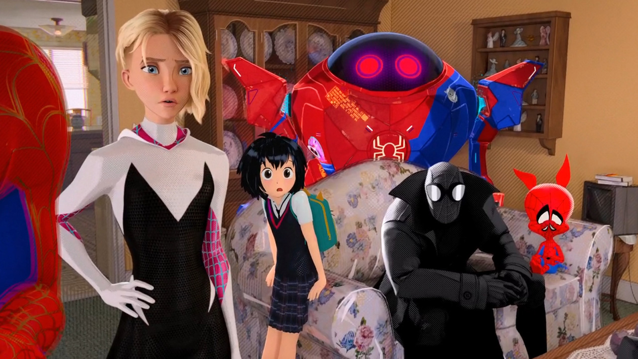
By acknowledging the extensive Spider-Man catalogue, and our exhaustion of it, Spider-Verse nimbly puts the weight of that IP underneath Miles, raising his origin story to a place above “the same old Spider-Man story.”
Even without the powers, the smart and adorkable Miles makes for an instantly likeable Spider-Man. The very first shot sees him doing one of the most relatable things in human existence—singing to a song and forgetting 80% of the lyrics. Formerly a king in his old block, you can’t help but feel for the guy when he’s turned into the jester at his new school. With spider powers sputtering out of him like sudden bursts of puberty, he automatically earns sympathy from anyone who’s ever been an awkward teenager (i.e. a teenager).
He’s also very distinctively a Black geeky teen from Brooklyn. The soundtrack, in particular, embraces that with needle drops from NYC’s hip-hop legends—Biggie’s Hypnotize, Run-DMC’s Mary Mary—as well as Gen Z-targeted earworms—Post Malone’s Sunflower, Blackway’s What’s Up Danger. It’s just another one of the many aspects that set this Spider-Man apart.
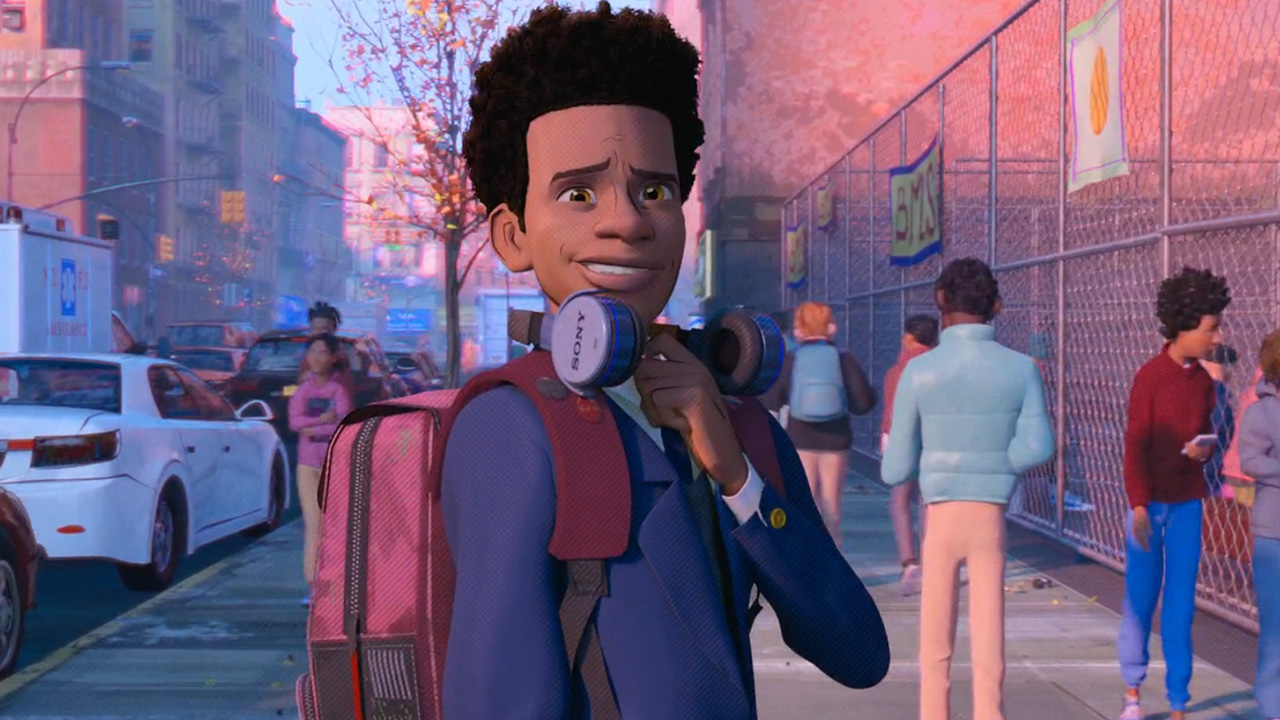
Yes, Miles still loses an uncle who also gives him dying words of wisdom, but this time, he has a support network of people who know exactly how he feels. Here, he’s not alone.
The moment Miles harnasses control of his powers and gains the confidence to become the hero they need, his status as a superhero is assured. Turning a running gag into a pivotal story moment, the film then cuts to the pile of comics from before and slams Miles’ issue on top of the heap—simply titled ‘Spider-Man’.
(The dizzying, eclectic climax deserves its own article. Perhaps a PhD dissertation.)
Into the Spider-Verse didn’t simply create an incredible visual style, it allowed the story to dictate this look. The film wouldn’t have worked had Sony Animation Studios mimicked the Disney-Pixar visual playbook, a type of stylised realism aggressively chased by other big animation studios for years.
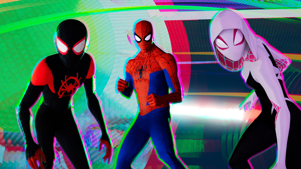
Sony Animation Studios administered a much-needed shock to the system and was widely recognised for it, becoming the only non-Disney-Pixar studio to win the Oscar for Best Animated Feature within a ten-year period (2012-2021). We’re already seeing its long-term impact on the industry with titles like The Bad Guys, Puss in Boots: The Last Wish, and Kid Cudi’s Entergalactic lovingly embracing the Spider-Verse toolkit while Sony’s own The Mitchells vs the Machines twists the style to more of a school kid scrapbook zone.
Whatever happens Across and Beyond the blockbuster animation landscape should excite everyone.
Netflix’s Klaus and Arcane, which were in development around the same time, helped foster this desire for more stylised big-budget animation while films like BlueSky’s tremendous (but sadly forgotten) 2015 Peanuts movie attempted similar innovations. But there’s no denying that, by virtue of being a $90,000,000 USD film intended for a global cinema release, Into the Spider-Verse took the biggest chance with its chosen narrative and visual style.
How’d they know it’d work so well? They didn’t. It’s a leap of faith. That’s all it is.


